Chapter 4 Descriptive statistics and plotting
4.1 The Cancer Gene Atlas (TCGA) - Pancreatic Ductal Adenocarcinoma Data Set
To develop a basic understanding of descriptive statistics and plotting we will use data described in Integrated Genomic Characterization of Pancreatic Ductal Adenocarcinoma. Cancer Cell. 2017;32(2):185-203.e13. doi:10.1016/j.ccell.2017.07.007.
The first step is to obtain the relevant data. We are primarily interested in:
- Gene expression data
- Clinical data and Transcriptomic subtype annotations
The Bioconductor package TCGAbiolinks provides easy to use functions for downloading and analysing data published by The Cancer Genome Atlas (TCGA). A list of TCGA publications can be found here https://www.cancer.gov/about-nci/organization/ccg/research/structural-genomics/tcga/publications.
Vignettes describing the TCGAbiolinks package can be found using browseVignettes("TCGAbiolinks")
The first step of any analysis is to define the libraries that we want to use:
library(TCGAbiolinks)
library(SummarizedExperiment)
The following code segment downloads normalized expression data generated by the TCGA-PAAD project and returns a RangedSummarizedExperiment object which we have assigned the name paad.
query.exp.hg19 <- GDCquery(project = "TCGA-PAAD",
                  data.category = "Gene expression",
                  data.type = "Gene expression quantification",
                  platform = "Illumina HiSeq",
                  file.type  = "normalized_results",
                  experimental.strategy = "RNA-Seq",
                  legacy = TRUE)
GDCdownload(query.exp.hg19)
paad <- GDCprepare(query.exp.hg19)
The paad object is of class RangedSummarizedExperiment which comprises expression data, clinical data and information about the study in which the data was generated.
paad
#> class: RangedSummarizedExperiment
#> dim: 19947 183
#> metadata(1): data_release
#> assays(1): normalized_count
#> rownames(19947): A1BG A2M ... TICAM2 SLC25A5-AS1
#> rowData names(3): gene_id entrezgene ensembl_gene_id
#> colnames(183): TCGA-3A-A9I7-01A-21R-A38C-07
#>   TCGA-IB-7885-01A-11R-2156-07 ... TCGA-IB-7888-01A-11R-2156-07
#>   TCGA-F2-A44H-01A-11R-A26U-07
#> colData names(122): sample patient ...
#>   subtype_Year.of.tobacco.smoking.onset subtype_patient
Data within the RangedSummarizedExperiment object can be obtained using a number of built-in helper functions which we can identify using the slotNames function.
slotNames(paad)
#> [1] "rowRanges"       "colData"         "assays"          "NAMES"
#> [5] "elementMetadata" "metadata"
4.1.1 Gene expression data
To access the expression data we use the assay()$normalized_count function:
normalisedCounts <- assays(paad)$normalized_count
normalisedCounts[1:5, 1:5]
#>              TCGA-3A-A9I7-01A-21R-A38C-07 TCGA-IB-7885-01A-11R-2156-07
#> A1BG                              67.4598                      46.5184
#> A2M                            14601.7751                   20869.5846
#> NAT1                             222.3161                     155.7439
#> NAT2                             208.3686                      11.7479
#> RP11-986E7.7                    8514.7929                   24899.2196
#>              TCGA-2J-AAB1-01A-11R-A41B-07 TCGA-2L-AAQJ-01A-12R-A39D-07
#> A1BG                              81.9122                      91.5297
#> A2M                            19703.8049                   15670.2079
#> NAT1                             119.5122                     148.5149
#> NAT2                              71.2195                      23.7624
#> RP11-986E7.7                    9787.8049                   15188.1188
#>              TCGA-2J-AABV-01A-12R-A41B-07
#> A1BG                             105.5118
#> A2M                            11981.9528
#> NAT1                              67.7165
#> NAT2                               0.0000
#> RP11-986E7.7                  158891.3543
Let’s explore normalisedCounts
class(normalisedCounts)
#> [1] "matrix"
dim(normalisedCounts)
#> [1] 19947   183
We can see that normalisedCounts is of class matrix and has 19947 rows (representing genes) and 183 columns (representing the patient samples).
We can extract the expression levels of GATA6 from normaliseCounts using the following notation [
head(normalisedCounts["GATA6", ])
#> TCGA-3A-A9I7-01A-21R-A38C-07 TCGA-IB-7885-01A-11R-2156-07
#>                     628.0642                     742.8044
#> TCGA-2J-AAB1-01A-11R-A41B-07 TCGA-2L-AAQJ-01A-12R-A39D-07
#>                    1664.3902                    1288.6139
#> TCGA-2J-AABV-01A-12R-A41B-07 TCGA-2J-AABE-01A-12R-A41B-07
#>                     826.7717                    1336.8275
4.1.2 Clinical data
To access the clinical data we can use the colData() function:
colData(paad)[1:5, 1:5]
#> DataFrame with 5 rows and 5 columns
#>                                        sample      patient
#>                                   <character>  <character>
#> TCGA-3A-A9I7-01A-21R-A38C-07 TCGA-3A-A9I7-01A TCGA-3A-A9I7
#> TCGA-IB-7885-01A-11R-2156-07 TCGA-IB-7885-01A TCGA-IB-7885
#> TCGA-2J-AAB1-01A-11R-A41B-07 TCGA-2J-AAB1-01A TCGA-2J-AAB1
#> TCGA-2L-AAQJ-01A-12R-A39D-07 TCGA-2L-AAQJ-01A TCGA-2L-AAQJ
#> TCGA-2J-AABV-01A-12R-A41B-07 TCGA-2J-AABV-01A TCGA-2J-AABV
#>                                                   barcode shortLetterCode
#>                                               <character>     <character>
#> TCGA-3A-A9I7-01A-21R-A38C-07 TCGA-3A-A9I7-01A-21R-A38C-07              TP
#> TCGA-IB-7885-01A-11R-2156-07 TCGA-IB-7885-01A-11R-2156-07              TP
#> TCGA-2J-AAB1-01A-11R-A41B-07 TCGA-2J-AAB1-01A-11R-A41B-07              TP
#> TCGA-2L-AAQJ-01A-12R-A39D-07 TCGA-2L-AAQJ-01A-12R-A39D-07              TP
#> TCGA-2J-AABV-01A-12R-A41B-07 TCGA-2J-AABV-01A-12R-A41B-07              TP
#>                                       definition
#>                                      <character>
#> TCGA-3A-A9I7-01A-21R-A38C-07 Primary solid Tumor
#> TCGA-IB-7885-01A-11R-2156-07 Primary solid Tumor
#> TCGA-2J-AAB1-01A-11R-A41B-07 Primary solid Tumor
#> TCGA-2L-AAQJ-01A-12R-A39D-07 Primary solid Tumor
#> TCGA-2J-AABV-01A-12R-A41B-07 Primary solid Tumor colnames(colData(paad))[1:20]
#> [1] "sample" "patient"
#> [3] "barcode" "shortLetterCode"
#> [5] "definition" "synchronous_malignancy"
#> ...
#> [15] "primary_diagnosis" "age_at_diagnosis"
#> [17] "updated_datetime.x" "prior_malignancy"
#> [19] "year_of_diagnosis" "prior_treatment"4.1.3 PDAC Subtypes
We are interested in obtaining Subtype specific information. The paad object comprises Subtype information for the Collisson, Moffitt and Bailey Classification schemes under the following columns:
colnames(colData(paad))[grep("subtype_mRNA", colnames(colData(paad)))]
#> [1] "subtype_mRNA.Moffitt.clusters..76.High.Purity.Samples.Only...1basal..2classical"
#> [2] "subtype_mRNA.Moffitt.clusters..All.150.Samples..1basal..2classical"
#> [3] "subtype_mRNA.Collisson.clusters..All.150.Samples..1classical.2exocrine.3QM"
#> [4] "subtype_mRNA.Bailey.Clusters..All.150.Samples..1squamous.2immunogenic.3progenitor.4ADEX"
Let’s extract the subtype information for the Moffitt classification scheme:
subtype <- colData(paad)[,"subtype_mRNA.Moffitt.clusters..All.150.Samples..1basal..2classical"]
subtype
#>   [1]  2  1  2  2  2  1  2  2  2  1  1  2  2  2  1  1  1  1  1  2 NA NA  2  2
#>  [25]  2 NA  2  1  2  1  1  2  2  1 NA  1  1  2  1  1 NA  1  2  2  1  1  2  2
#>  [49] NA  1  1  1  2 NA  2  2  2 NA  2 NA  2  1  1 NA  1  2  2  1  2  2  1  1
#>  [73]  1  2  2  2  2 NA  1  2  2  1  2  2 NA  1  2  2  2 NA  2  2  1  2 NA  2
#>  [97]  1  2  1  2  1  1  2 NA NA  2  1  1  2  1  2  1 NA  1  2 NA  2  1  2 NA
#> [121]  1  2  2  1  2  2  1  2  2 NA  2  1  1  2 NA  2  2 NA NA  1 NA  1  2  2
#> [145]  1 NA  2 NA  2  1  2  2  1  1  2  2 NA  1  2 NA  1  2  1 NA  2 NA  2 NA
#> [169]  1  2  2 NA  1  2  1  2 NA  1  1  1  1  2  2
We want to compare the expression of a specific gene between the Classical and Basal samples. Looking at the subtype vector that we have just created there are multiple samples that do not have a Moffitt subtype - designated by NA. We need to remove these!
expFinal <- normalisedCounts[,!is.na(subtype)]
subtypeFinal <- subtype[!is.na(subtype)]
subtypeFinal[subtypeFinal == 1] <- "Basal"
subtypeFinal[subtypeFinal == 2] <- "Classical"
subtypeFinal
#>   [1] "Classical" "Basal"     "Classical" "Classical" "Classical" "Basal"
#>   [7] "Classical" "Classical" "Classical" "Basal"     "Basal"     "Classical"
#>  [13] "Classical" "Classical" "Basal"     "Basal"     "Basal"     "Basal"
#>  ...
#> [133] "Basal"     "Classical" "Basal"     "Classical" "Classical" "Basal"
#> [139] "Classical" "Classical" "Basal"     "Classical" "Basal"     "Classical"
#> [145] "Basal"     "Basal"     "Basal"     "Basal"     "Classical" "Classical"
4.2 Descriptive plots
4.2.1 Boxplots
A common task that we are asked to perform is: Determine whether a given gene is enriched in a specific PDAC subtype.
How do we go about performing such a task and what sort of plots are useful in describing differences between groups?
A popular method to display data involves drawing a box around the first and the third quartile (a bold line segment for the median), and the smaller line segments (whiskers) for the smallest and the largest data values. Such a data display is known as a box-and-whisker plot.
expData <- data.frame(samplename=colnames(expFinal), GATA6=expFinal["GATA6",],
                      HNF4A=expFinal["HNF4A",], EGFR=expFinal["EGFR",],
                      S100A2=expFinal["S100A2",], Subtype=subtypeFinal)
head(expData)
#>                                                samplename     GATA6
#> TCGA-3A-A9I7-01A-21R-A38C-07 TCGA-3A-A9I7-01A-21R-A38C-07  628.0642
#> TCGA-IB-7885-01A-11R-2156-07 TCGA-IB-7885-01A-11R-2156-07  742.8044
#> TCGA-2J-AAB1-01A-11R-A41B-07 TCGA-2J-AAB1-01A-11R-A41B-07 1664.3902
#> TCGA-2L-AAQJ-01A-12R-A39D-07 TCGA-2L-AAQJ-01A-12R-A39D-07 1288.6139
#> TCGA-2J-AABV-01A-12R-A41B-07 TCGA-2J-AABV-01A-12R-A41B-07  826.7717
#> TCGA-2J-AABE-01A-12R-A41B-07 TCGA-2J-AABE-01A-12R-A41B-07 1336.8275
#>                                  HNF4A      EGFR    S100A2   Subtype
#> TCGA-3A-A9I7-01A-21R-A38C-07 2199.9155  515.8199 2453.9307 Classical
#> TCGA-IB-7885-01A-11R-2156-07  631.3670 1057.2997 1694.7218     Basal
#> TCGA-2J-AAB1-01A-11R-A41B-07 1254.1463  845.2976  136.0976 Classical
#> TCGA-2L-AAQJ-01A-12R-A39D-07 1263.8614  590.4901  209.4059 Classical
#> TCGA-2J-AABV-01A-12R-A41B-07  322.8346  157.4803  311.8110 Classical
#> TCGA-2J-AABE-01A-12R-A41B-07  581.4706  483.4161  125.7900     Basal
To generate boxplots we will use the ggpubr package of plotting functions, which make generating publication quality plots simple. To generate a boxplot demonstrating the difference in GATA6 gene expression between the Basal and Classical subtypes run the following code snippet:
library(ggpubr)
ggboxplot(expData, x = "Subtype", y = "GATA6",
          title = "GATA6 Expression by Subtype", ylab = "Expression",
          color = "Subtype", palette = "jco")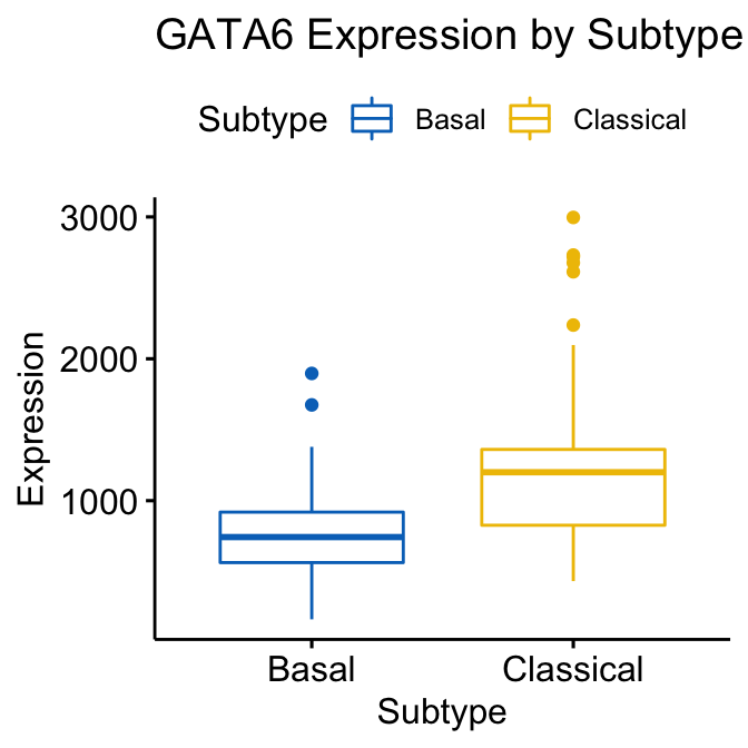
Figure 4.1: GATA6 Boxplot generated using ggboxplot coloured by Subtype
We can also generate plots showing the relative expression of multiple genes. Here we combine boxplots for both the GATA6 and HNF4A genes.
ggboxplot(expData, x = "Subtype", y = c("GATA6","HNF4A"),
          title = "Expression by Subtype",
          combine = TRUE,
          ylab = "Expression",
          color = "Subtype", palette = "jco")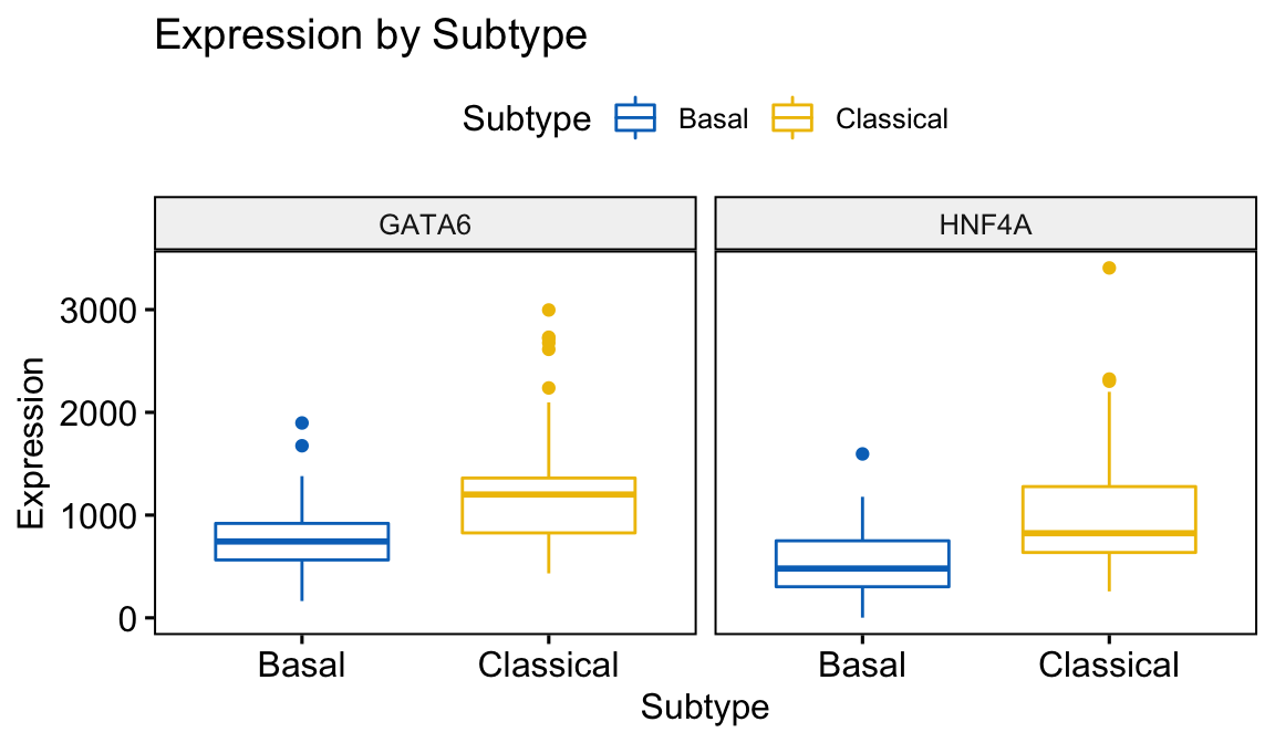
Figure 4.2: Combined Boxplot generated using ggboxplot coloured by Subtype
The plotting function gghistogram can be used to generate a density histogram of the gene expression values for GATA6 and HNF4A.
gghistogram(expData,
       x = c("GATA6","HNF4A"),
       y = "..density..",
       combine = TRUE,                  # Combine the 3 plots
       xlab = "Expression",
       add = "median",                  # Add median line.
       rug = TRUE,                      # Add marginal rug
       color = "Subtype",
       fill = "Subtype",
       palette = "jco"
)
#> Warning: Using `bins = 30` by default. Pick better value with the argument
#> `bins`.
#> Warning: `group_by_()` is deprecated as of dplyr 0.7.0.
#> Please use `group_by()` instead.
#> See vignette('programming') for more help
#> This warning is displayed once every 8 hours.
#> Call `lifecycle::last_warnings()` to see where this warning was generated.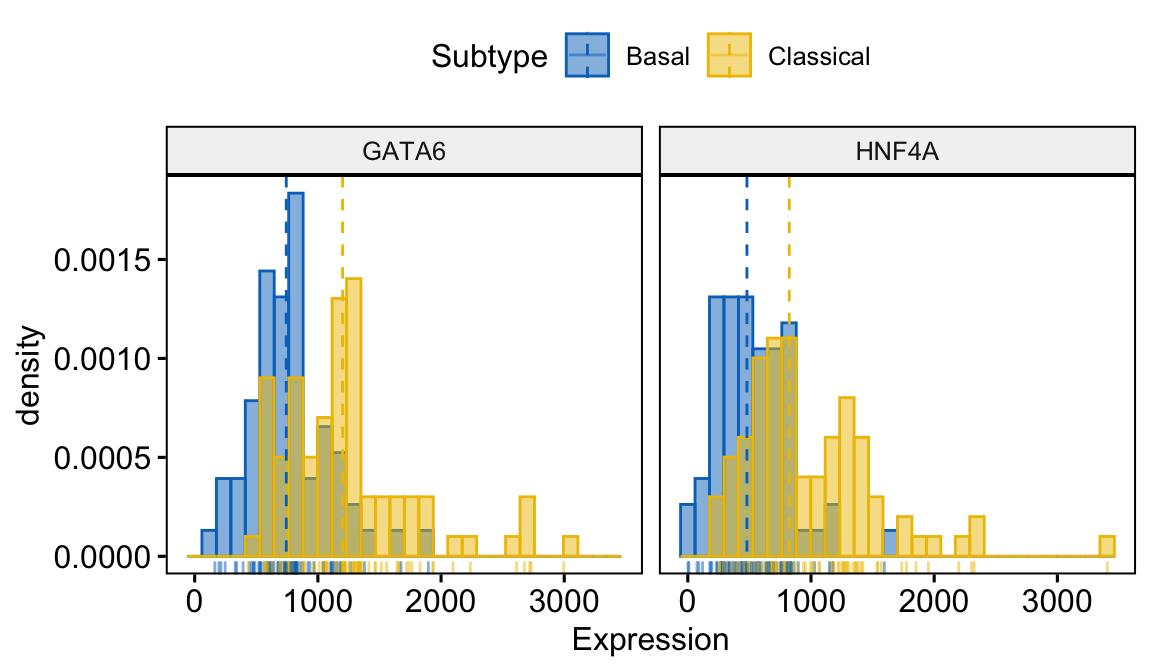
Figure 4.3: Combined density histogram generated using gghistogram coloured by Subtype
To determine the statistical significance of the equality of the distributions we can take advantage of the stat_compare_means function. First we provide a vector of subtype names that we wish to compare - see my_comparisons variable.
my_comparisons <- list(c("Basal", "Classical"))

ggboxplot(expData, x = "Subtype", y = c("GATA6","HNF4A"),
          title = "Expression by Subtype",
          combine = TRUE,
          ylab = "Expression",
          color = "Subtype", palette = "jco") +
  stat_compare_means(comparisons = my_comparisons,)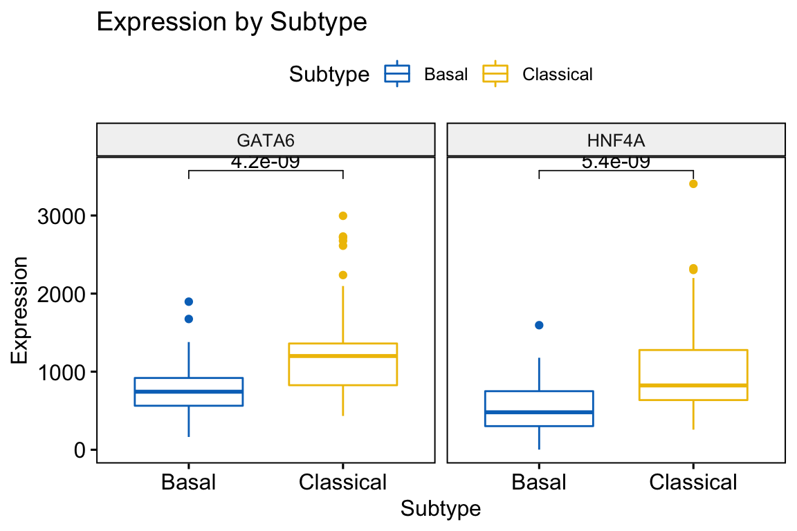
Figure 4.4: Combined Boxplot showing significance generated using ggboxplot and stat_compare_means coloured by Subtype
What statistical test is being performed? To find a detailed summary of the statistical tests performed, we can use the compare_means function.
compare_means(GATA6 ~ Subtype, data=expData)
#> # A tibble: 1 x 8
#>   .y.   group1 group2                p        p.adj p.format p.signif method
#>   <chr> <chr>  <chr>             <dbl>        <dbl> <chr>    <chr>    <chr>
#> 1 GATA6 Basal  Classical 0.00000000424 0.0000000042 4.2e-09  ****     Wilcox…
Exercise 4.1
Repeat the above analysis using the Bailey classification scheme. How do the classification schemes differ?
4.2.2 Scatter plots
Another common task is to determine the relationship or correlation between the expression of 2 genes. A scatter plot, where expression values for individual genes are positioned along the x and y axes, can be an effective means of describing the correlation between genes. In the following example we will look at genes having positive and negative correlation with GATA6 using the ggscatter function. We will also add the statistical significance of the correlation using the stat_cor function and include the regression line and confidence interval.
First let’s identify genes that are positively and negatively correlated with GATA6.
#Calculate the spearman correlation
corGenes <- apply(expFinal, 1, function(i){
  cor(expFinal["GATA6",],i, method = "spearman")
})
#Identify top negatively correlated genes
head(corGenes[order(corGenes)])
#>     ADAM19      BICD2       ARSI     CHST11      PTPN1       PYGL
#> -0.5897631 -0.5516601 -0.5438659 -0.5425646 -0.5338886 -0.5319081
#Identify top positively correlated genes
head(corGenes[order(corGenes, decreasing = TRUE)])
#>     GATA6  C9orf152    COLCA2      FMO5    COLCA1   HSD17B2
#> 1.0000000 0.6421103 0.6379999 0.6319445 0.6310378 0.6218854
corData <- data.frame(samplename=colnames(expFinal), GATA6=expFinal["GATA6",],
                       ADAM19=expFinal["ADAM19",], C9orf152=expFinal["C9orf152",], Subtype=subtypeFinal)
Now produce a scatter plot showing the correlation for a negatively correlated gene.
ggscatter(corData, x = "GATA6", y = "ADAM19", size = 0.6,
          rug = TRUE, # Add marginal rug
          add = "reg.line", conf.int = TRUE) +
  stat_cor(method = "spearman")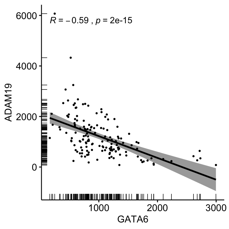
Figure 4.5: Correlation bewteen the expression of GATA6 and ADAM19 using ggscatter and stat_cor coloured by Subtype
Now produce a scatter plot showing the correlation for a positively correlated gene.
ggscatter(corData, x = "GATA6", y = "C9orf152", size = 0.6,
          rug = TRUE, # Add marginal rug
          add = "reg.line", conf.int = TRUE) +
  stat_cor(method = "spearman")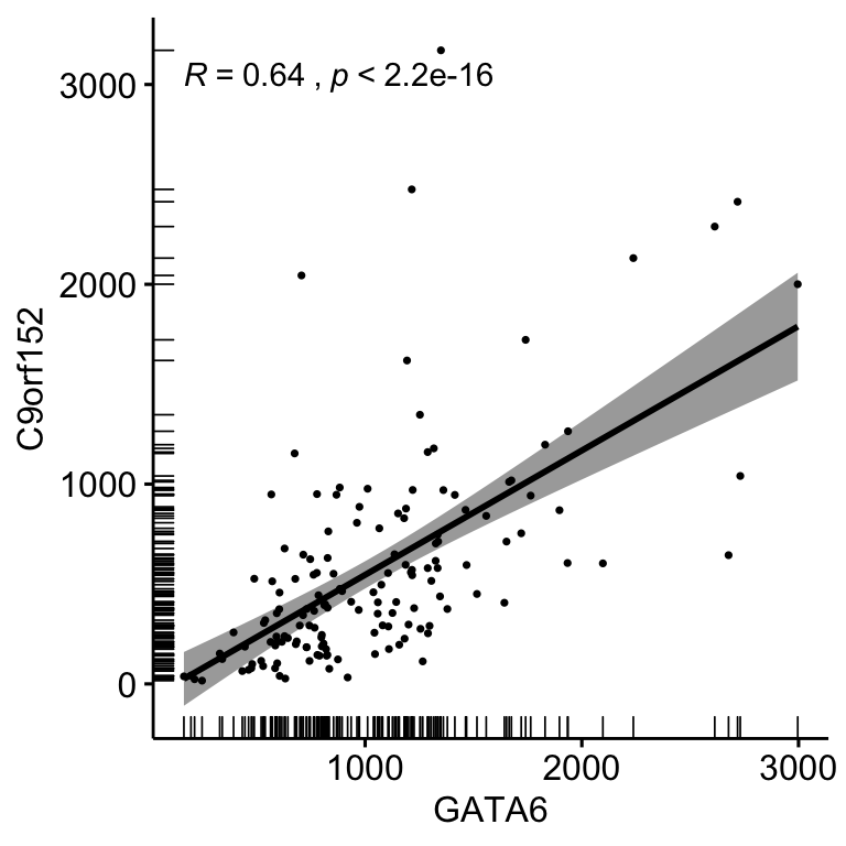
Figure 4.6: Correlation bewteen the expression of GATA6 and C9orf152 using ggscatter and stat_cor coloured by Subtype
Exercise 4.2
Are these genes significantly associated with the Classical or Basal subtype? Refering to Figure 4.7, select genes that either cluster together or separately and generate a correlation plot as above.
4.2.3 Hierarchical Clustering
Clustering is a common analysis performed for gene expression data. The most often performed clustering method is hierarchical clustering, which typically takes the form of a heatmap.
We will first compute the Pearson correlation between the genes. Note that we must operate on the transpose of the matrix because the R function cor() operates on the columns.
Before computing the Pearson correlation let’s reduce the size of our gene expression matrix to the 100 most variable genes.
# First create a helper function
rnaSelectTopVarGenes <- function(normCounts, n=2000){
  mad <- apply(normCounts, 1, mad)
  ords <- names(sort(mad, decreasing=TRUE))
  select <- normCounts[ords[1:n],]
  select
}

top100 <- rnaSelectTopVarGenes(expFinal, n=100)

rownames(top100)[1:20]
#>  [1] "COL1A1"  "COL3A1"  "COL1A2"  "FN1"     "S100A6"  "SPARC"   "ACTG1"
#>  [8] "ADAM6"   "OLFM4"   "KRT19"   "FTL"     "CEACAM6" "EEF1A1"  "KRT8"
#> [15] "LYZ"     "CD74"    "C3"      "ACTG1"   "INS"     "GAPDH"
Now we can compute the Pearson correlation between these genes.
genes.cor <- cor(t(top100), use="pairwise.complete.obs", method="pearson")
genes.cor[1:10,1:10]
#>             COL1A1      COL3A1      COL1A2          FN1      S100A6
#> COL1A1  1.00000000  0.90111805  0.95213503  0.704581917 -0.03986419
#> COL3A1  0.90111805  1.00000000  0.97895658  0.810404331 -0.17087257
#> COL1A2  0.95213503  0.97895658  1.00000000  0.810587796 -0.09929872
#> ADAM6   0.06159559  0.09015272  0.07347763 -0.006385034 -0.26308892
#> OLFM4  -0.11225845 -0.15559795 -0.14019860 -0.157354325  0.11383937
#> KRT19  -0.08529548 -0.20568537 -0.13710624 -0.057904466  0.59689349
#>             SPARC       ACTG1       ADAM6       OLFM4       KRT19
#> COL1A1  0.8537446  0.38503182  0.06159559 -0.11225845 -0.08529548
#> COL3A1  0.9310155  0.25595807  0.09015272 -0.15559795 -0.20568537
#> COL1A2  0.9331879  0.32340518  0.07347763 -0.14019860 -0.13710624
#>  ...<4 more rows>...
#> ADAM6   0.1679487 -0.04011457  1.00000000 -0.08934060 -0.26114447
#> OLFM4  -0.1692385  0.01464192 -0.08934060  1.00000000  0.00350131
#> KRT19  -0.2371568  0.41379145 -0.26114447  0.00350131  1.00000000
The Pearson correlation coefficient is a similarity metric, values of which vary from -1 (perfect anti-correlation) to +1 (perfect correlation), see Lectures Chap.1. Pearson’s correlation can be transformed into a distance metric by subtracting from 1. The Pearson distance would then vary from 0 (perfect correlation) to 2 (perfect anti-correlation). Hierarchical clustering of the Pearson distance metric can be achieved by the hclust() function. We will use the average linkage as an agglomeration rule.
genes.cor.dist <- as.dist(1-genes.cor)
genes.tree <- hclust(genes.cor.dist, method='average')
plot(genes.tree, xlab=NULL, cex=0.5)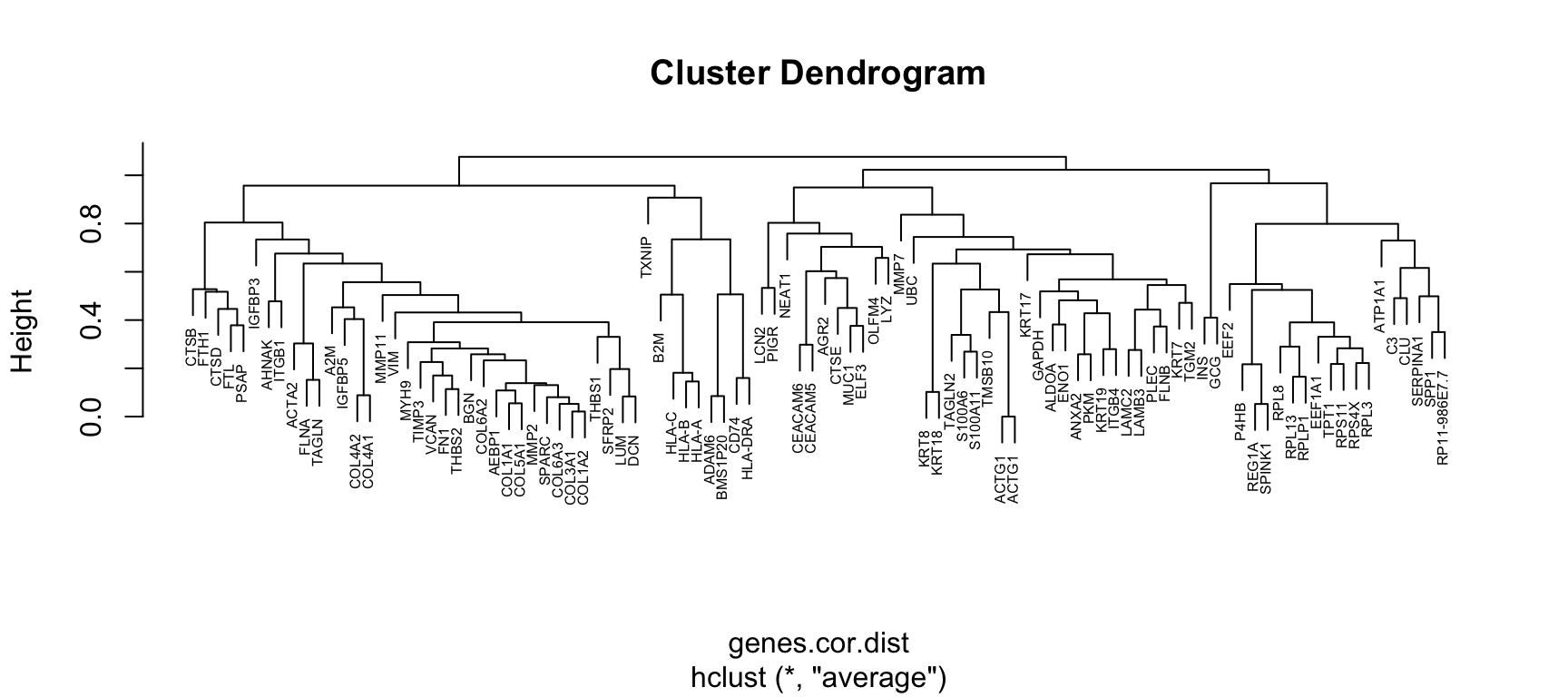
Figure 4.7: Gene clustering by Pearson distance and average linkage
Exercise 4.3
What do you observe? Does the clustering make any sense?
A question that we might ask is whether the top 100 variable genes can discriminate Classical and Basal subtypes? We can answer this question by performing hierarchical clustering. To make our results a little easier to interpret let’s modify our top100 matrix by switching the column names to the PDAC subtype designations.
colnames(top100) <- subtypeFinal
colnames(top100)[1:10]
#>  [1] "Classical" "Basal"     "Classical" "Classical" "Classical" "Basal"
#>  [7] "Classical" "Classical" "Classical" "Basal"
Next let’s compute correlations between samples by using the Spearman rank as the metric.
samples.cor.spearman <- cor(top100,use="pairwise.complete.obs", method="spearman")
samples.cor.spearman.dist <- as.dist(1-samples.cor.spearman)
samples.tree <- hclust(samples.cor.spearman.dist, method='average')
plot(samples.tree, cex=0.5, xlab=NULL)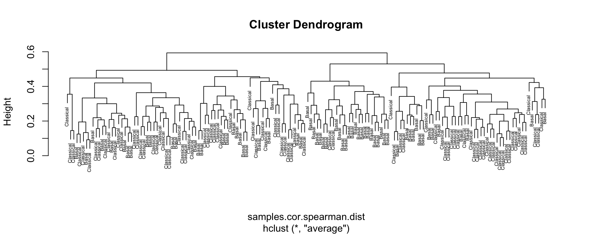
Figure 4.8: Sample clustering by Spearman distance and average linkage
Exercise 4.4
What do you observe? Are the top 100 variables good at descriminating Classical from Basal samples? Would increasing the number of variable genes to 1000 help? What other agglomeration methods may be used with the hclust method?
4.2.4 Hierarchical clustering using the Moffitt transcriptomic signature
Based on our previous clustering analysis, the top 100 most variable genes were not very good at discriminating the Classical and Basal samples. Let’s now use the genes that make up the Moffitt signature - this should allow us to classify the samples correctly!
First we subset the expFinal matrix using the Moffitt classifier genes.
mSig <- read.csv("course/Moffitt_gene_signature.csv", stringsAsFactors = FALSE)
head(mSig)
#>     symbol     Group
#> 1    MUC13 Classical
#> 2    GPR35 Classical
#> 3    USH1C Classical
#> 4 BAIAP2L2 Classical
#> 5  GAL3ST1 Classical
#> 6     VIL1 Classical
dim(mSig)
#> [1] 88  2
expFinalSig <- expFinal[rownames(expFinal) %in% mSig$symbol,]
dim(expFinal)
#> [1] 19947   150
dim(expFinalSig)
#> [1]  86 150
Let’s now compute correlations between samples by using the Spearman rank as the metric, as before!
#Set column names to Subtypes
colnames(expFinalSig) <- subtypeFinal
#Perform clustering
samples.cor.spearman <- cor(expFinalSig,use="pairwise.complete.obs", method="spearman")
samples.cor.spearman.dist <- as.dist(1-samples.cor.spearman)
samples.tree <- hclust(samples.cor.spearman.dist, method='average')
plot(samples.tree, cex=0.5, xlab=NULL)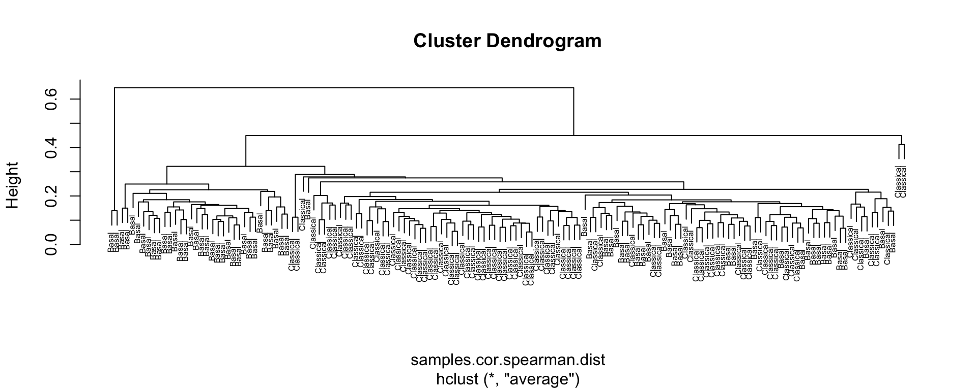
Figure 4.9: Sample clustering by Spearman distance and average linkage using Moffitt gene signature
Exercise 4.5
What do you observe? Can we now descriminate Classical from Basal patient samples?
4.2.5 Heatmaps
Hierarchical clustering methods enable hierarchical representations of a measure of dissimilarity between groups of observations (i.e. groups of genes and groups of patients in our PAAD example). The measure of dissimilarity is based on pairwise dissimilarities among the observations in the two groups.
In the context of microarray or RNAseq data, a heatmap arranges both the rows and the columns of the expression matrix in orderings derived from hierarchical clustering. By cutting the dendrograms at various heights, different number of clusters emerge and the set of clusters are nested within one another.
For our first example we will use the expFinalSig matrix representing genes defining the Moffitt classification scheme. The ComplexHeatmap and circlize packages will do the majority of the work! In this example we will generate an annotation track above the heatmap to show which samples are Classical and which are Basal.
library(ComplexHeatmap)
library(circlize)
#First we scale the matrix
expFinalSig <- t(scale(t(expFinalSig)))
#Generate a list of colours to map to the Subtypes
colors <- RColorBrewer::brewer.pal(8, "Set1")
#Generate the annotation
ha <- HeatmapAnnotation(Moffitt = subtypeFinal,
                        col = list(Moffitt = structure(names = c(
                          "Classical", "Basal"
                        ), colors[1:2])))
#Generate the heatmap
Heatmap(
  expFinalSig,
  col = colorRamp2(c(-2, 0, 2), c("#377EB8", "white", "#E41A1C")),
  name = "Z score",
  cluster_columns = TRUE,
  cluster_rows = TRUE,
  top_annotation = ha,
  show_row_names = TRUE,
  show_column_names = TRUE,
  row_names_gp = gpar(fontsize = 8),
  column_names_gp = gpar(fontsize = 5)
)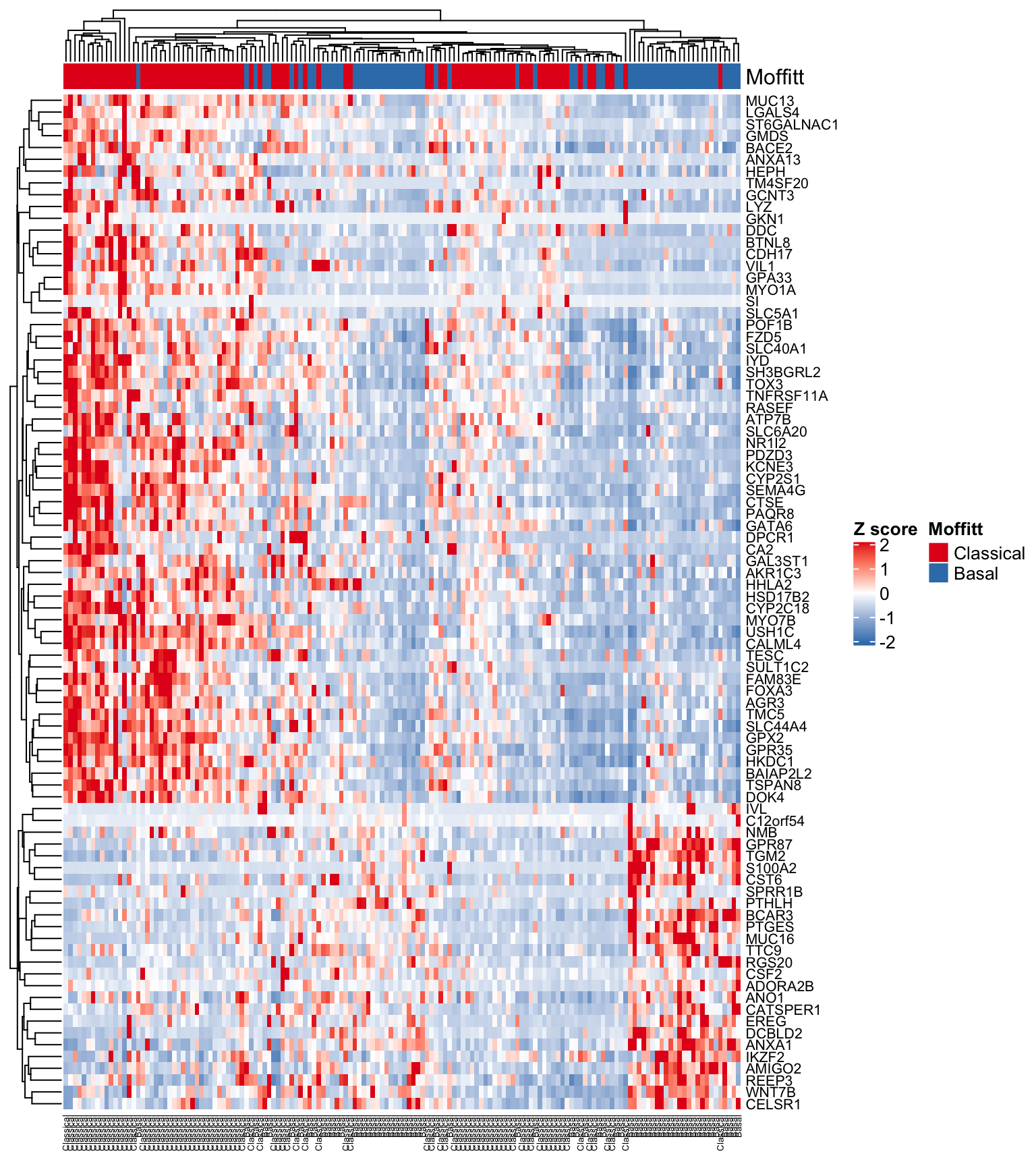
Figure 4.10: Heatmap using Moffitt gene signature
We seem to be getting a good separation of the samples but it would be nice to have all of the Classical and Basal samples grouped together. Let’s first sort the subtypeFinal vector and columns of the expFinalSig matrix into their respective subtypes and regenerate the heatmap.
head(order(subtypeFinal, decreasing = TRUE))
#> [1] 1 3 4 5 7 8
subOrdered <- subtypeFinal[order(subtypeFinal, decreasing = TRUE)]
expFinalSigOrd <- expFinalSig[, order(subtypeFinal, decreasing = TRUE)]
#Make the sample annotation track
ha <- HeatmapAnnotation(Moffitt = subOrdered,
                        col = list(Moffitt = structure(names = c(
                          "Classical", "Basal"
                        ), colors[1:2])))
#Generate the heatmap
Heatmap(
  expFinalSigOrd ,
  col = colorRamp2(c(-2, 0, 2), c("#377EB8", "white", "#E41A1C")),
  name = "Z score",
  cluster_columns = FALSE, #Turned clustering of columns off!!!
  cluster_rows = TRUE,
  top_annotation = ha,
  show_row_names = TRUE,
  show_column_names = TRUE,
  row_names_gp = gpar(fontsize = 8),
  column_names_gp = gpar(fontsize = 5)
)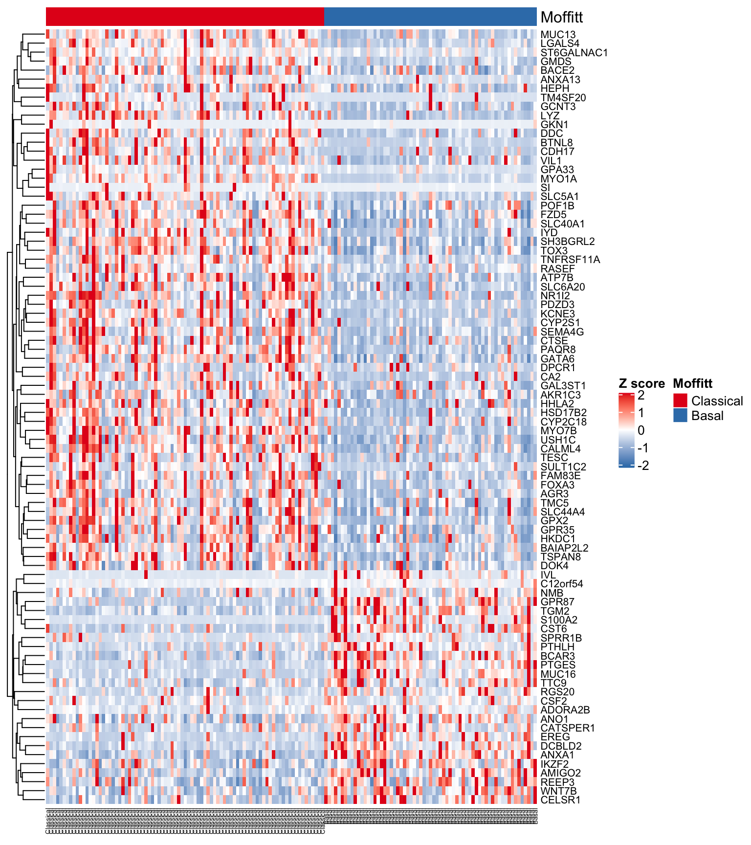
Figure 4.11: Heatmap using Moffitt gene signature ordered by subtype
Let’s also annotate genes that discriminate the subtypes. To do this we will use the Heatmap split argument.
#Map matrix gene names to subtype
partition <- rep(NA, nrow(expFinalSig))
partition[rownames(expFinalSig) %in% mSig$symbol[mSig$Group == "Basal-like"]] <- "Basal"
partition[rownames(expFinalSig) %in% mSig$symbol[mSig$Group == "Classical"]] <- "Classical"
head(partition)
#> [1] "Basal"     "Basal"     "Classical" "Classical" "Classical" "Classical"
#Make the sample annotation track
ha <- HeatmapAnnotation(Moffitt = subOrdered,
                        col = list(Moffitt = structure(names = c(
                          "Classical", "Basal"
                        ), colors[1:2])))
#Generate the heatmap
Heatmap(
  expFinalSigOrd ,
  col = colorRamp2(c(-2, 0, 2), c("#377EB8", "white", "#E41A1C")),
  name = "Z score",
  cluster_columns = FALSE, #Turned clustering of columns off!!!
  cluster_rows = TRUE,
  top_annotation = ha,
  split=partition, #added a partition argument
  show_row_names = TRUE,
  show_column_names = TRUE,
  row_names_gp = gpar(fontsize = 8),
  column_names_gp = gpar(fontsize = 5)
)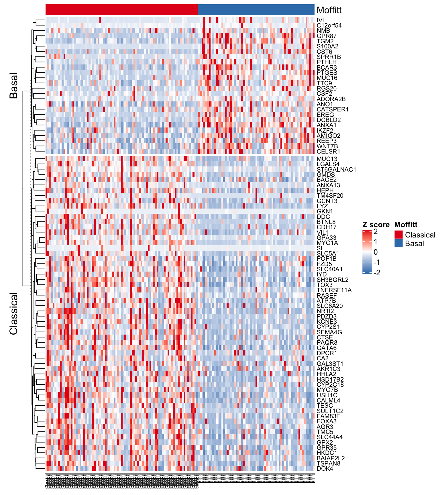
Figure 4.12: Heatmap using Moffitt gene signature ordered by subtype and with gene annotations
Exercise 4.6
Add the Collisson and Bailey subtype designations to the Heatmap annotation track! How do they compare?